Data Grid
Data Grid
A Data Grid is used to display tabled data in a form.
In order to add a Data Grid drag the shape from the Form Toolbox onto the Form and drop it at the desired location.
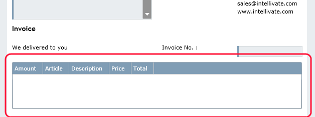
Sample Data Grid
Properties
This Element utilizes beside the General Element Properties the following properties:
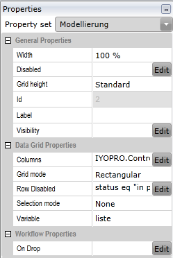
General Parameters
Grid Height |
Specify the height of the data grid. You may choose between
|
Grid Height Factor |
Enter the factor by which the data grid should be higher (E.g.: 2 = double) |
Min Height |
Specify the minimum height, that the data grid should have |
Stretch Proportion |
Specify the size ratio of the control to other controls with stretch mode |
Data Grid Parameters
Columns |
Specify the Data Grid Columns with the Data Grid Column Editor |
Grid mode |
Select the structure of the rows. You may choose between
|
Tree variable |
Choose a variable that identifies the child elements |
Row Disabled |
You may disable specific rows |
Selection mode |
Specify whether rows of the data grid can be selected |
Variable |
The name of the variable, where the Data is taken from |
Workflow Parameters
Grid Action |
You may specify an expression to be executed when an Action button is / Action buttons are pressed |
On Drop |
You may specify an expression to be executed when you insert content per drag and drop |
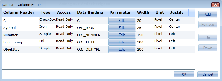
The Data Grid Column Editor
The Data Grid Column Editor is used, to specify the columns in the Data Grid.
Column Types
IYOPRO provides the following column types:
Create new Column
To Create a Column press the Add Button. In the upcoming dialog specify:
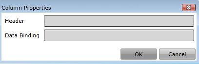
Header: The header of the column shown in the Datagrid
Data Binding: The technical name of the column in the underlying value dictionary
Delete Column
Select the column to delete and press the remove button
Change Column Order
Select a column to move and press the Up / Down buttons to rearrange the columns
Change Column Header
To change the header of a column double-click into the Column Header cell of the column and edit the value
Change Column Type
To change the type of a column double-click into the Column Type cell of the column and choose the value
Change Column Access
To change the access mode of a column double-click into the Column Access cell of the column and choose the value
Change Column Data Binding
To change the Data Binding of a column double-click into the Data Binding cell of the column and edit the value
Change Column Parameter
To change the Parameter of a column click the Edit button of the column and enter the value
Change Column Width
To change the width of a column double-click into the Width cell of the column and edit the value
Change Column Width Unit
To change the width unit of a column double-click into the Unit cell of the column and choose the value
(A Data Grid only handles one unit. If you use pixel and percent in the same Data Grid every pixel value will be handled as a percent value)
Change Column Justification
To change the justification of a column double-click into the Justify cell of the column and edit the value
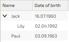
Use the tree mode - an example
This example, based on a family tree, shows how to display data as a child element in tree mode:
Tree variable = child
Without a child element:
form["grid"] = [{"Name": "Jack", "Date of birth":"16.07.1960"}, {"Name": "Paul", "Date of birth":"03.09.1963"}]
With a child element using the tree variable:
form["grid"] = [{"Name": "Jack", "Date of birth":"16.07.1960", "child":[{"Name": "Lily", "Date of birth":"02.04.1992"}]},{"Name": "Paul", "Date of birth":"03.09.1963"}]
It would then look like this in the data grid: